What interested you about the MW project?
First and foremost, I assess potential projects by the people I’ll be teaming up with. I was familiar with Plucky work from those clever 1:1 manager cards so I was thrilled when Jen reached out, but even more so after our initial meeting.
My partners need to be kind and thoughtful collaborators–it’s how I protect my time and sanity! I was so drawn to Jen’s positive, action-oriented energy. PLUS, it’s always nice to bond with someone over the unique struggles of parenting in a pandemic.
Usually in agency life the projects are short lived but the connections and friendships are much longer term. That’s why I do this work and these projects–the relationships.
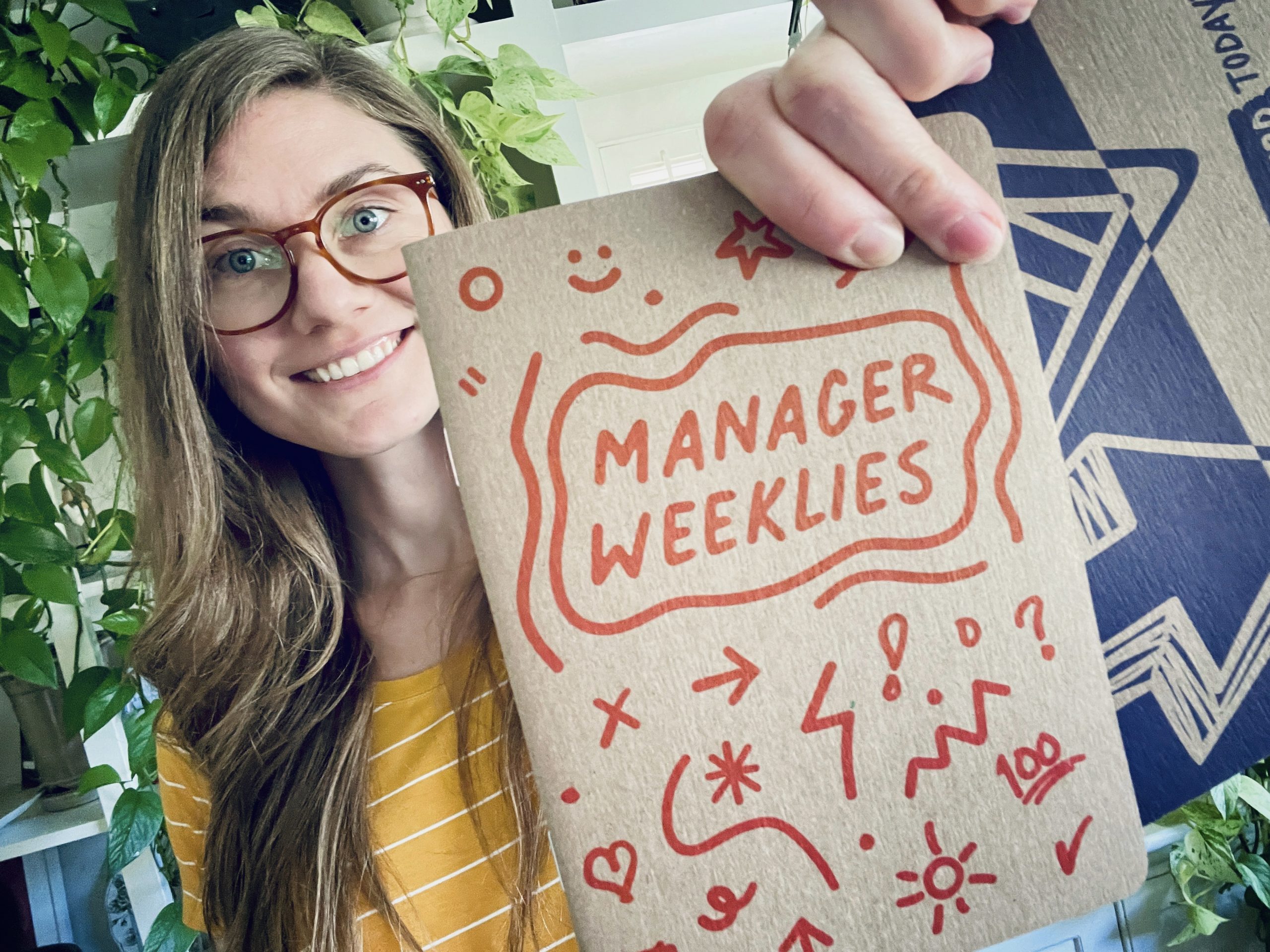
I also just personally adore notebooks, doodling, and accountability through an orderly process. I’m all about any tangible thing that helps me make sense of my tangled, abstract thoughts. I simply loved the idea of helping bring something to life that could have this same impact on people’s work days.
What were the important elements in building this design?
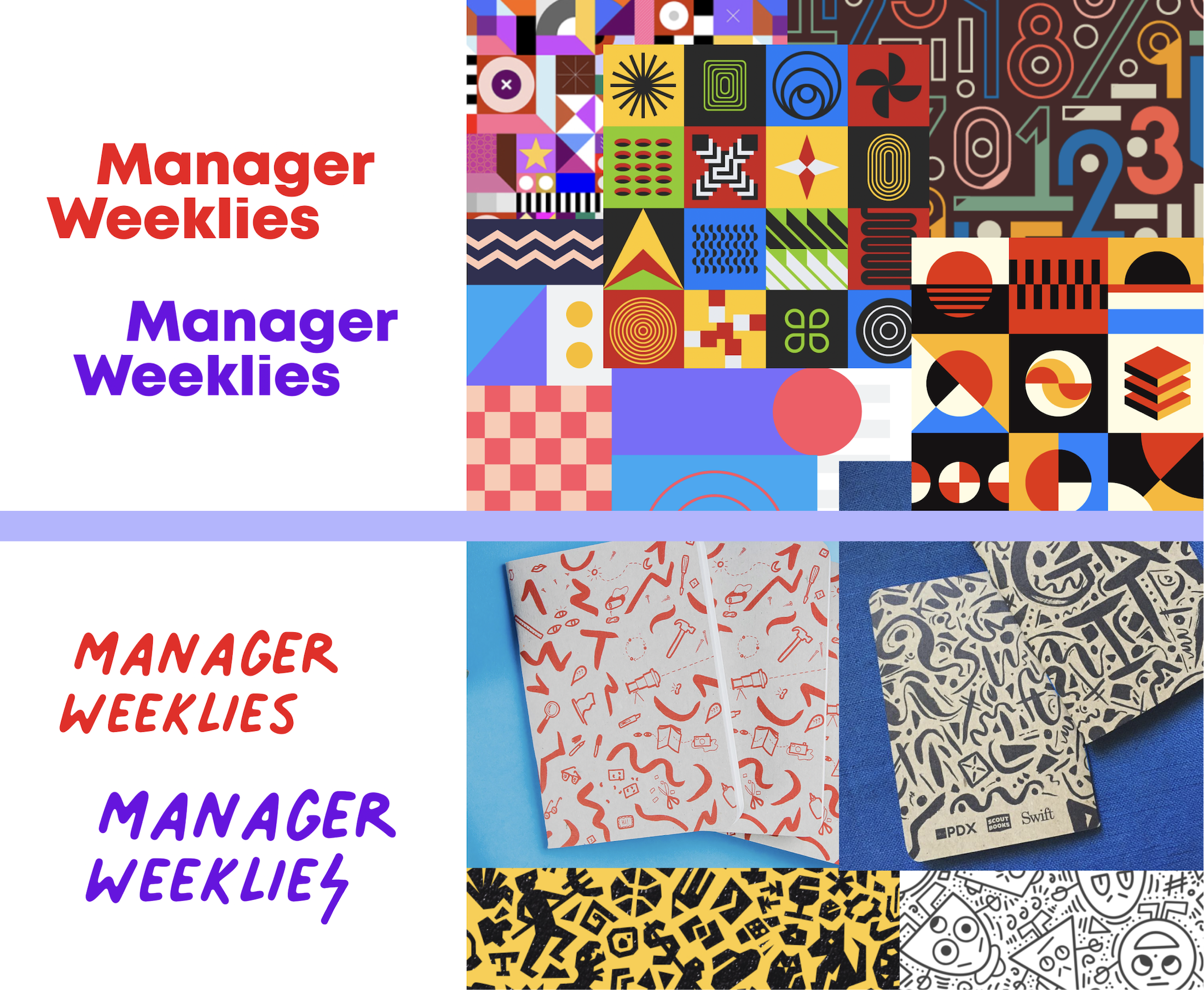
The most important thing I kept in mind when initially developing the brand identity for this project was capturing the Plucky personality. It’s a fun, heartfelt, down-to-earth look and feel. This new product needed to communicate those same traits while also being able to stand on its own when explored out of context.
The bold palette is based on some existing brand colors as well as what Scout Books offers. While purple and red are the stars of the shows, there’s a secondary palette that helps enrich the digital graphics.
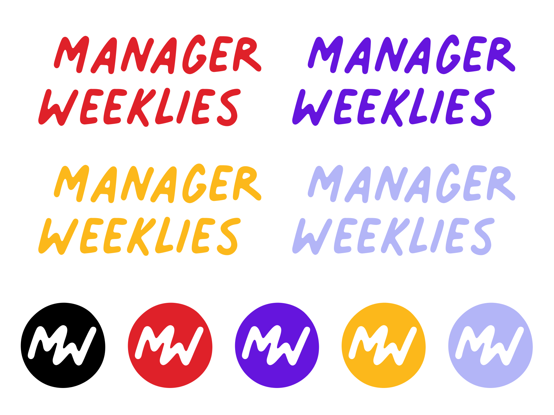
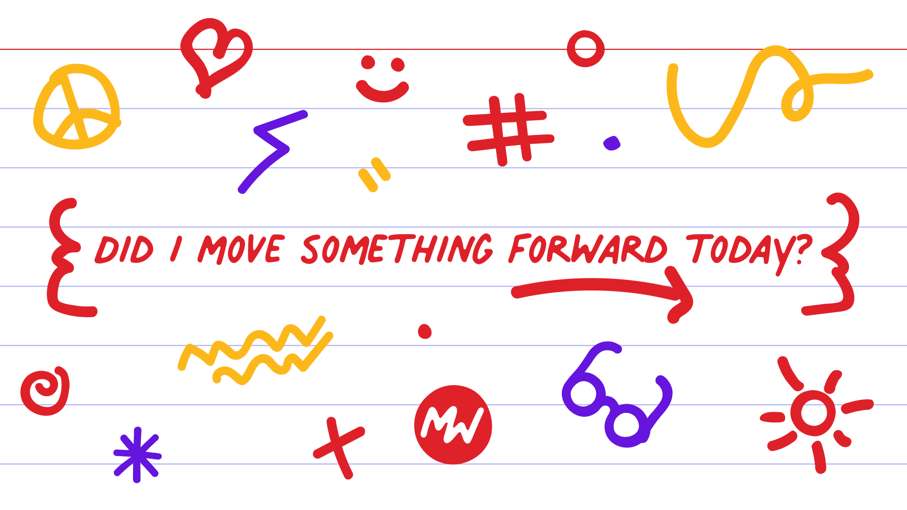
The lovely, rough, hand drawn font used is Palmer Lake Print. It’s a perfect pairing to Plucky’s love for doodle notes and drove the style for the icons–thick and imperfect.
Once I got started drawing icons it was difficult to stop as they quickly became the foundation of the project in terms of aesthetic and communication. Through some blob brush magic, we were able to put together quite an extensive collection of silly but relevant images that can support the project’s promotion for years to come.
A final important element was making sure the inner pages were designed in a way that prioritized writing. So while the covers could be fun and busy and use ALL THE THINGS, the inside needed to feel clean and calm.
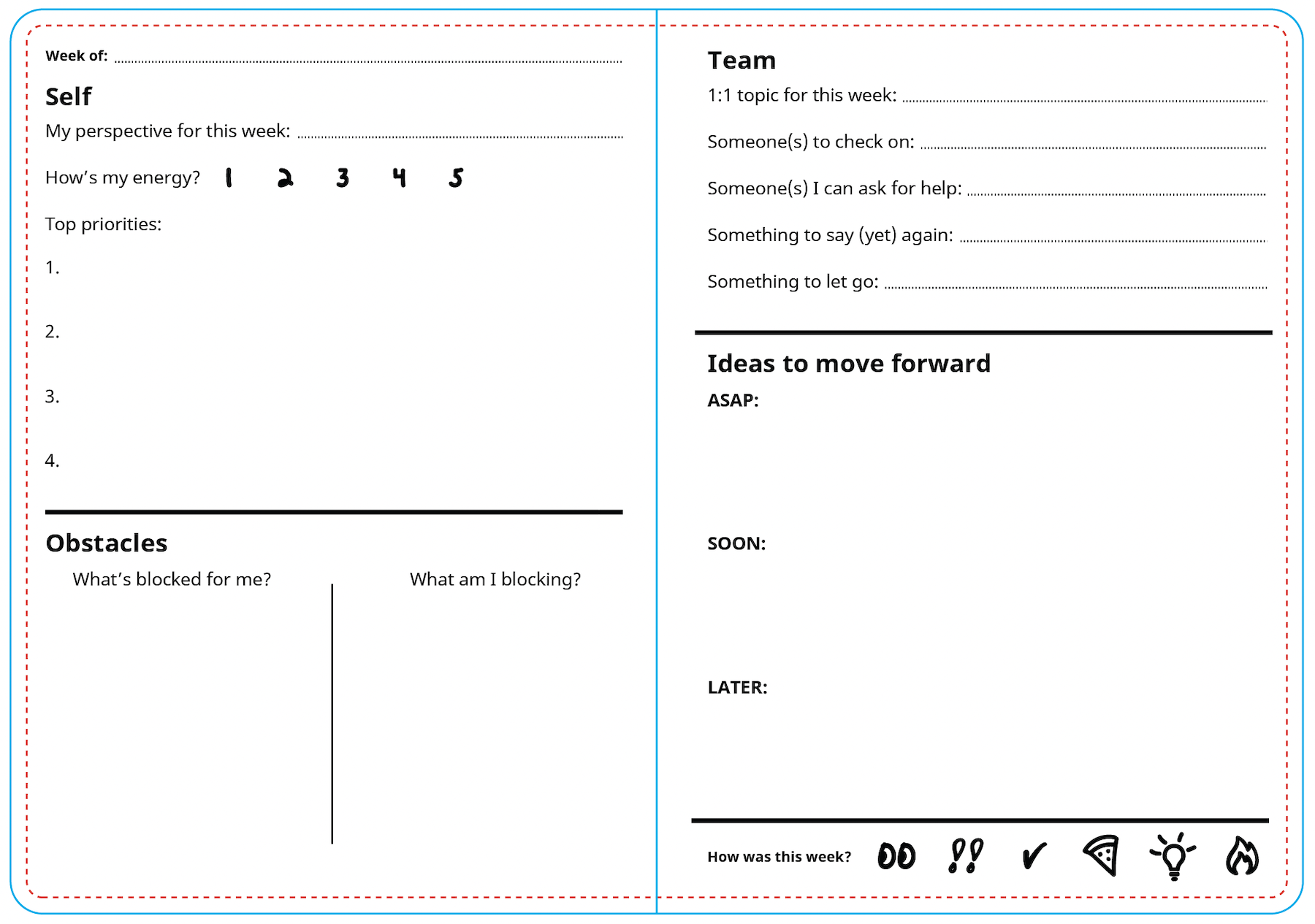
Following the printer’s guidelines is critical here to get the best sense of spacing. When I designed my first Scout Books notebook years ago I got so paranoid about whether or not the centerfold would eat up too much space, causing some edge designs to be hidden. Well, they luckily do not! So I knew I could factor that into the layout.
What was fun/different about designing something that would be put on physical products? How did it change your process?
Designing for the web is largely forgiving when it comes to circling back to imperfections or making corrections. There’s also expansive documentation and community around tools and issues. Print has what feels like endless gotchas that you can only learn from experience.
Things like CMYK, converting text to shapes, bleeds, “punching” out designs, selecting all anchor points to find and delete pesky stray items, are luckily all things I learned years ago. Still though, I always add a few extra days to the timeline to account for getting an extra set of eyes on things before sending them to the printer. It’s also helpful to establish a solid working relationship with a print company since no one will know the right process and quirks like they do.
And of course, always get a proof! It’s weird how this shift in presentation can reset your eyes to catch the tiniest of details.
What impact do you hope Manager Weeklies will have on workplaces/managers?
I truly hope that these guided notebooks help bring confidence and clarity to those writing and doodling in them. There’s so much value in collecting your thoughts in a deliberate way away from a screen.
Managers will feel newly energized with these notebooks in hand, ready to tackle their most challenging tasks in a more proactive, reflective, and holistic way. Manager Weeklies will be such a stellar addition to their professional toolbox.
Anything else fun to share?
A final, potentially fun thing I’d like to share is the original mood board we worked from at the beginning of our journey.
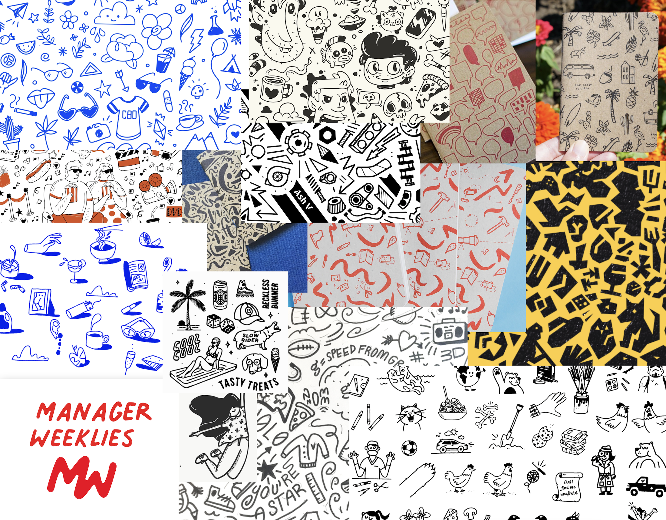
Mood boards are an incredibly helpful step when starting a visual design project, as it allows designers and clients to agree on a general direction before committing too much to a style that ultimately goes nowhere. I prefer doing these chats over video calls to better gauge reactions and Jen’s was hilariously one of extreme delight.
This was such a fun project retrospective. Thanks Jen and best of luck to the new Manager Weeklies crew out there! If anyone wants to chat about mood boards or that special feeling of cracking open a fresh notebook I can be reached at joni@yupgup.com.
_________
Captain and design lead at YupGup